Project Plan + Screener
Usability Testing
Evaluation and Recommendations
04
Findings
Difficult to navigate the “Change location” option which can also be used to add a new address.
The size of the button and font size is small
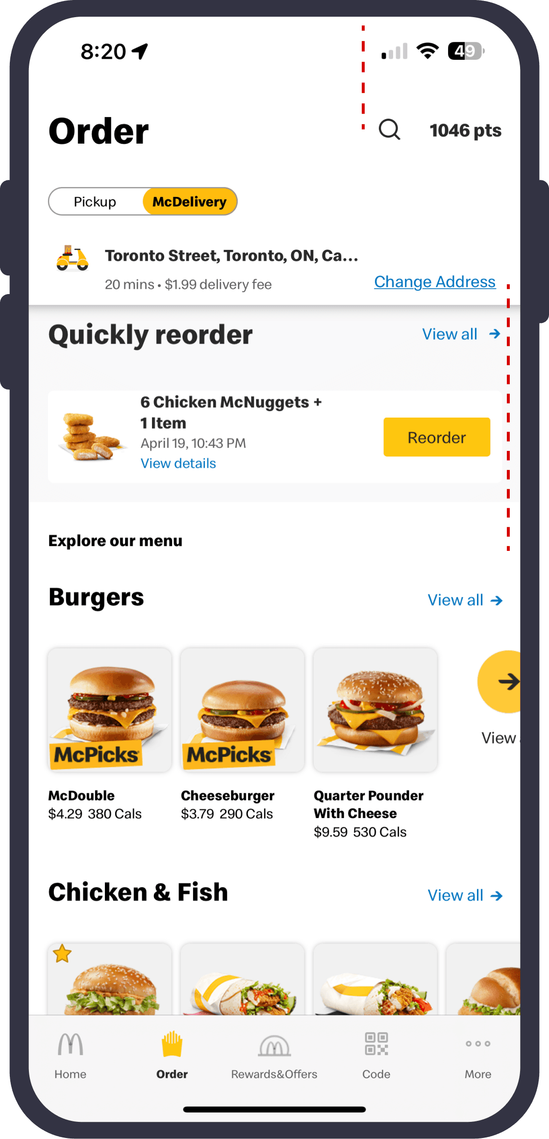
Change Address
Pickup/McDelivery Button
The address doesn’t reflect the name added like “Home” or “Business”
Location Name
Difficult to navigate the search option.
Search Icon
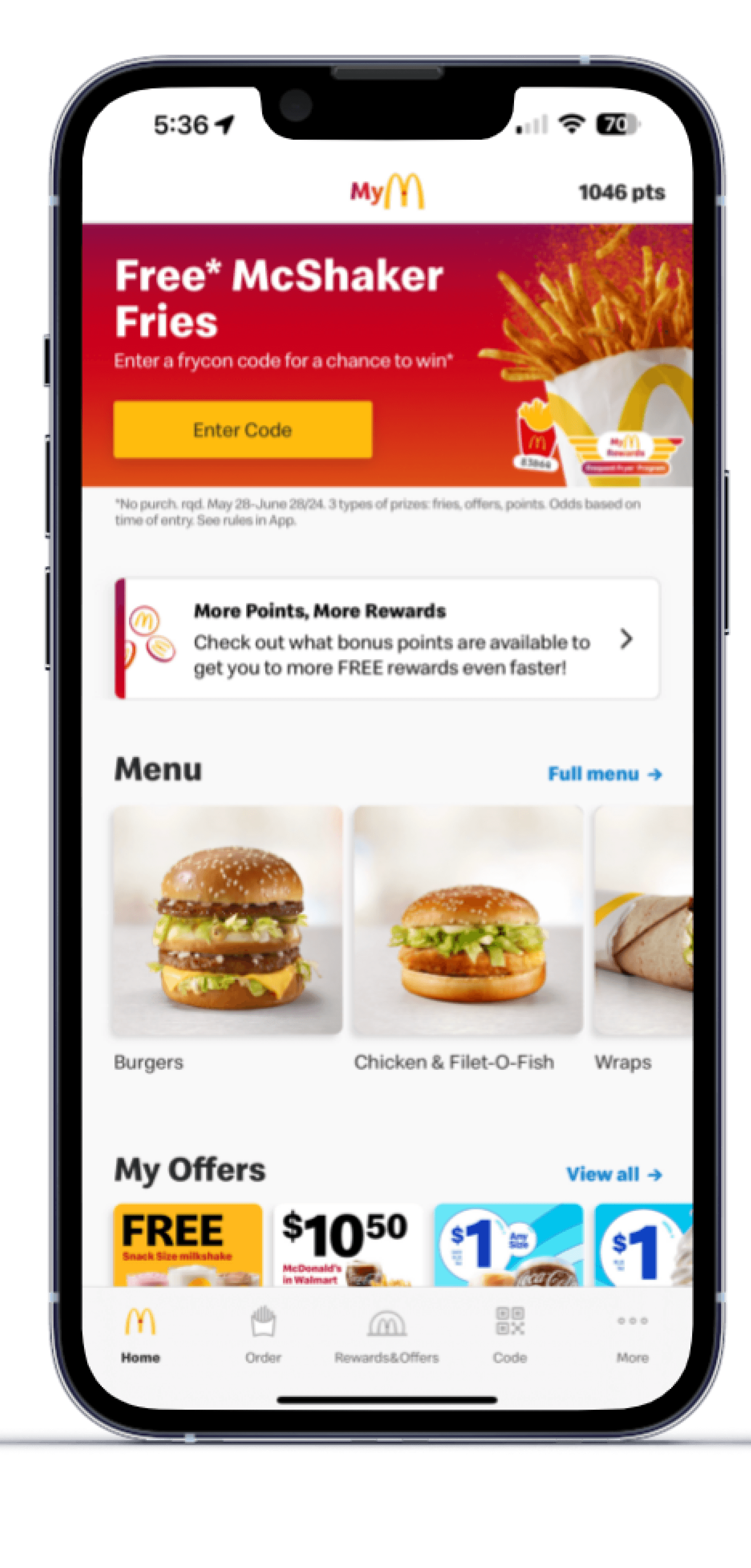
Unclear to assume that the “log In” option would be under “More”.
The Sign in/ Log in option is not visible on the home screen but under another screen to find.
More
Sign In
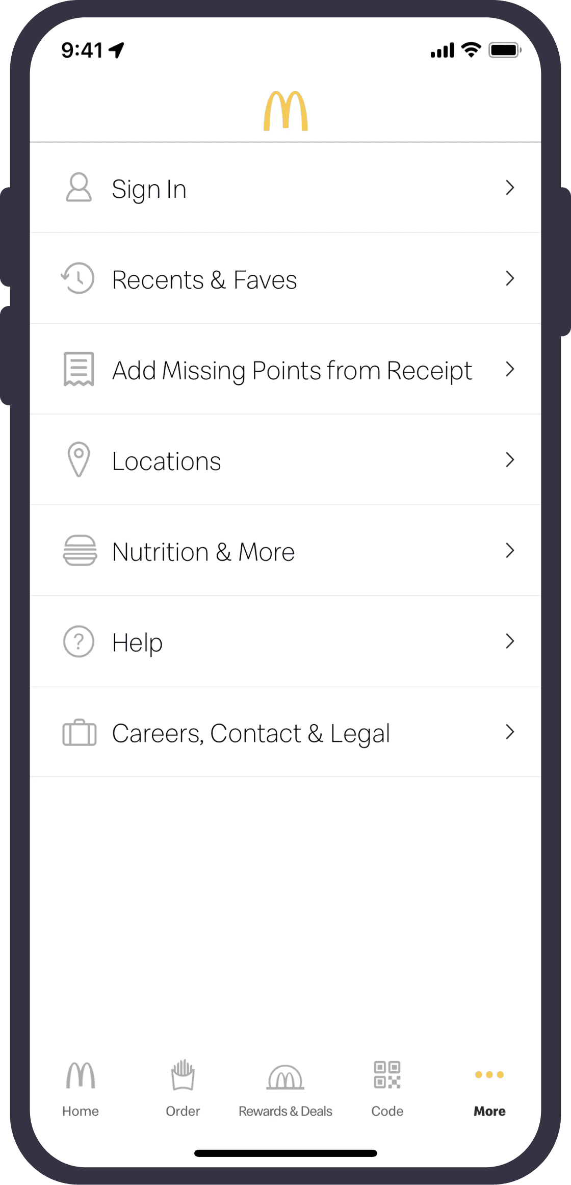
“Locations” confuse users as an option to add their location or address for pickup/delivery rather than “store locations”.
Location
The users were confused between “Burgers” and “Chicken & Fish” options. Users went inside the burger category
to explore all types of burgers.
Terminology
MENU PAGE
Users find this helpful to know more information about the ingredients used in the food items.
Information looks clustered in one single area of the screen.
Information about Nutrition
Too much information
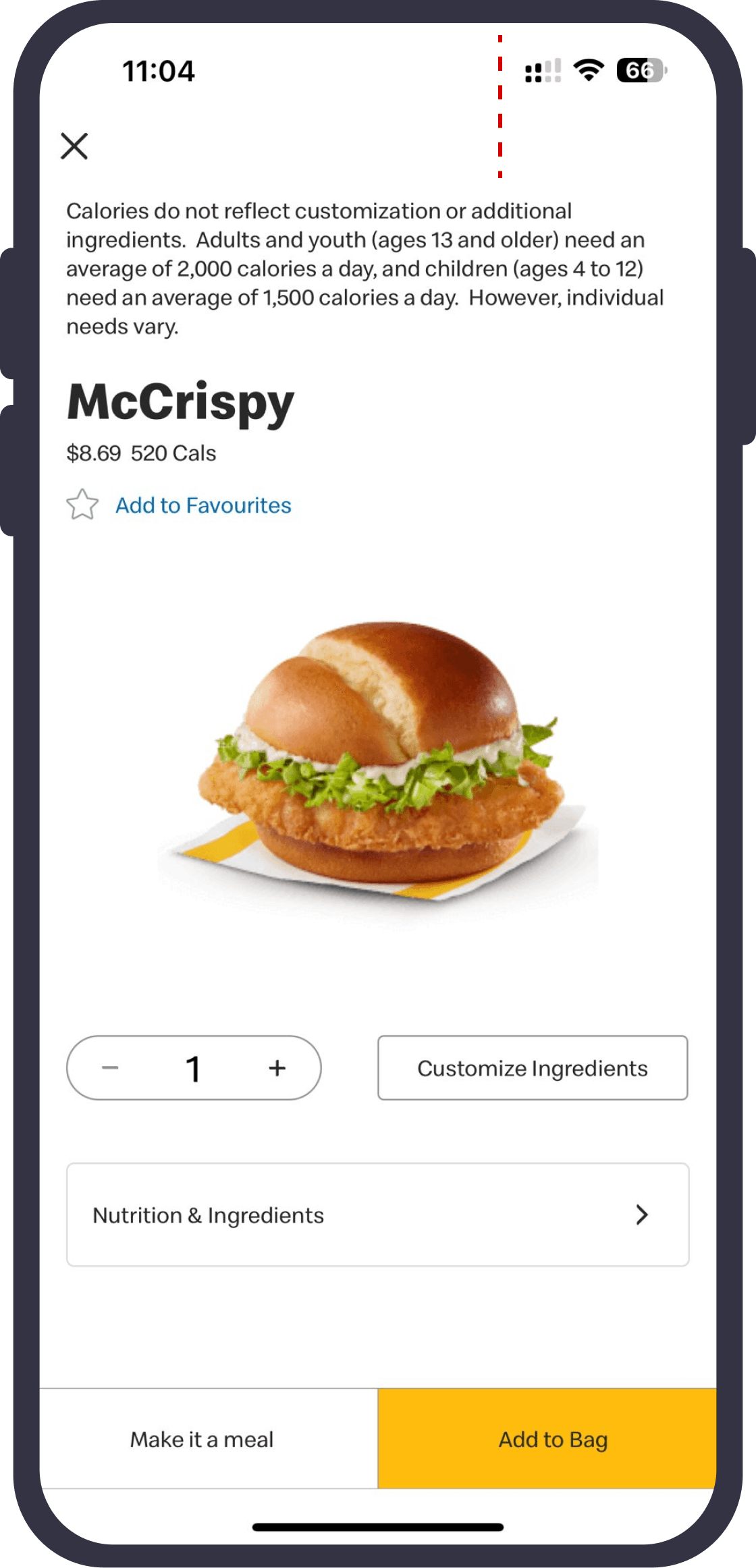
Font size is small to read and no font size difference between price and calories of the product.
Price Details
The users did not understand the need to read calories description before the product name and details.
Calories Description
“Make it a meal” option is helpful at this stage.
Meal Option
However, the drinks have to be added separately and not in a meal.
Font of the quantity is bigger than the price
Customized elements added not shown in the cart.
Font size
No customization visible
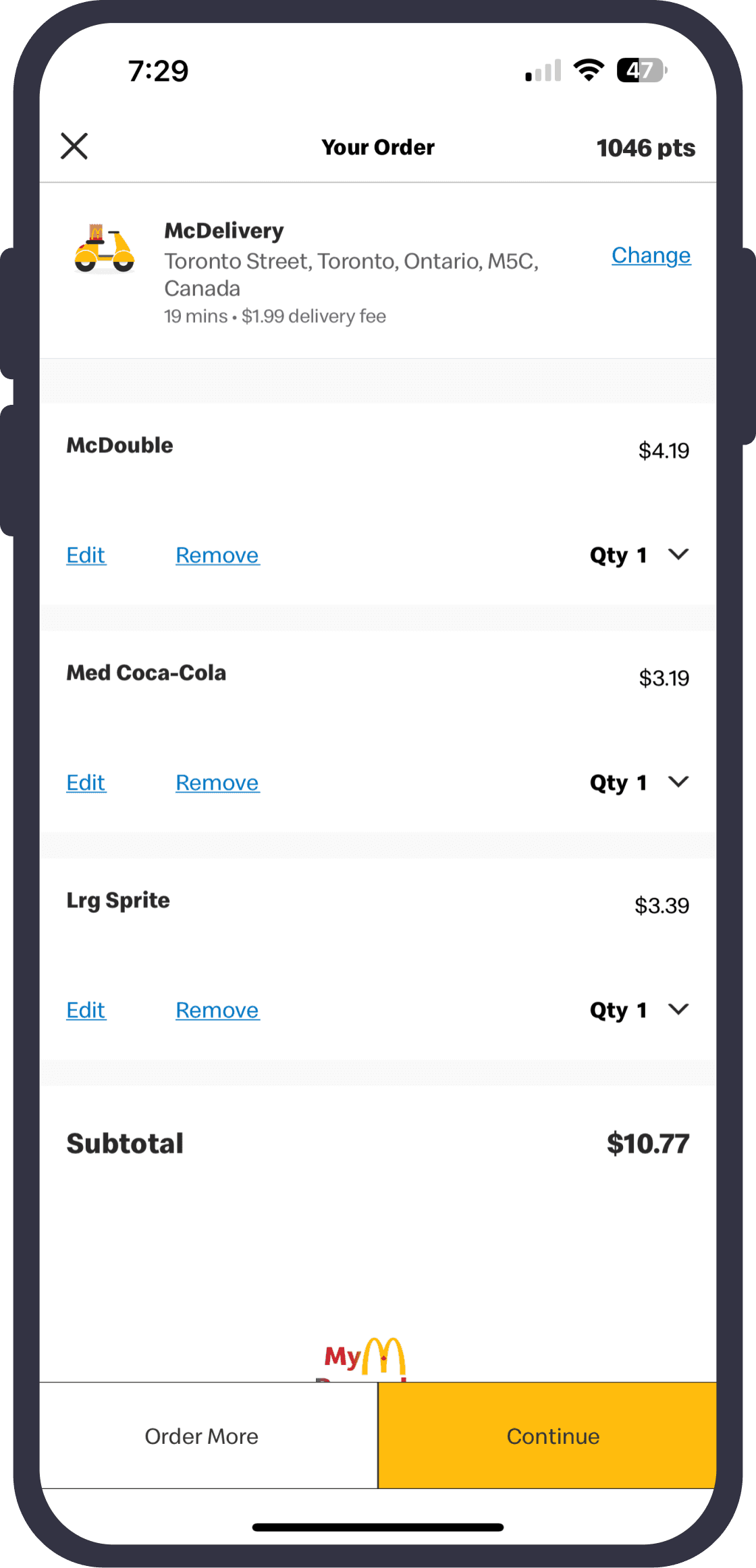
Size option is unclear in the cart and written before the item name
Drink size
Continue and order more options overlapping with the rewards logo.
Overlapping
05
Recommendations
Highlight the placement of Sign Up/ Login option on the “Homepage” instead of “More”
For easy navigation, food and drink items can be categorized such as burgers (chicken, beef) fries, drinks, desserts, etc.
Create a clear hierarchy of information on the screens with variable yet proportionate font size.
Make adding and managing addresses easier, and make it simple for users to rename addresses as "Home" or "Work"
Add more filter options, such as filtering food products by calories, to help users find what they need more easily.
For increase in transparency while checking out, give distinct information for each size of item in the cart.
06
Learnings
Explore More Projects

Gained insights into analyzing and evaluating user needs and behaviors to inform the design of intuitive and user-friendly app interfaces.

Learned how to assess and recommend key app functionalities, such as mobile ordering, loyalty rewards, and location services, to enhance convenience and user satisfaction.

Understood the importance of evaluating and ensuring brand consistency in digital products to maintain a strong brand identity and customer loyalty.